Commission from Texas

SOLD via Etsy
Completed commission, just shipped to Texas. Acrylic on 16 x 25 panel.

Source snapshots, from which I “photoshopped” the composition together:

Commission from Texas Read More »
SOLD via Etsy
Completed commission, just shipped to Texas. Acrylic on 16 x 25 panel.
Source snapshots, from which I “photoshopped” the composition together:
Commission from Texas Read More »


SOLD via Etsy
I worked on this anniversary portrait at the show, getting it about 90% done by Sunday. It was fun to be able to ask passersby and other OSA members for critique and recommendations. It’s for an Etsy commission; I sent my customer a digital image of it for approval last week and he said, “You are a genius! I love it! It is amazing! I am so grateful to you. I will pay for it tonight. No changes necessary. Thank you!!!!!” Music to my ears…very encouraging. I hope his wife likes it as well as he does, or better. It’s acrylic on a 16 x 26 hardwood panel, from customer supplied old snapshot:

Anniversary Portrait Read More »
All the hard work preparing for the show was worth it! I had a great time painting for five days in a row, it was like a painting retreat. I received lots of positive comments, and many people said they would contact me for future commissions. I’m in communication with two prospects from the show who I think will follow through with commissions. I also got invited back by the show manager to be a demo artist at the Fall Home & Garden Show, Oct. 4-7, 2012 at the Expo Center. I’d like to be positioned with the Oregon Society of Artists again.

My booth (above) at the Spring Home & Garden Show about a week ago. As a designated “demo artist” I painted much of the time between 10 a.m. to 8 p.m. except for breaks.
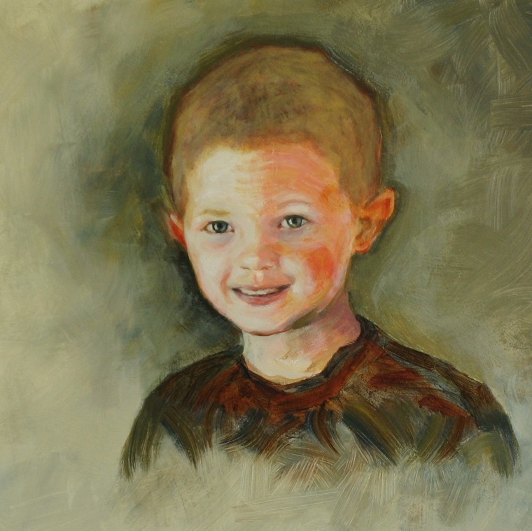
I finished up a painting of one of my grandsons while at the show:

…thanks to Joel Bock Photography for permission to use one of his photos as reference. It was fun to work on Espen’s characteristic crooked little half grin.
I’m mostly recovered / caught up / unpacked from the show…and MORE than ready to dive back into painting.
Show went very well! Read More »

SOLD via Etsy
Commission for newlyweds in Texas, acrylic on panel. 22-1/2″ x 16″; given as a gift from relatives, who had this to say about it: “This is BEAUTIFUL!!!!!!!!!!! It’s perfect!!!!!!!! My dear–they are going to LOVE this!!!!!! Amazing!!!!!!!! Thank you!! You really captured their beauty–aren’t they a stunning couple? <Name withheld> looks like a supermodel.”
Newlyweds Portrait Read More »

Yes it’s been awhile since my last post, but I’ve been getting a LOT done on the painting front! (including making frames, above)
Most importantly, I was invited by the Oregon Society of Artists to be one of their “anchor artists” at the Portland Home & Garden Show, next week: Feb 22-26! I’ve done shows for sculpture before, but this will be my debut with my “new” medium: portrait painting. I hope my banner and business cards arrive before Feb 22…and I finish making frames on time…and figure out how to light my booth…etc etc x etc. At least paintings will be a hell of a lot easier to transport than ceramic sculpture!
I will be demonstrating painting for five days straight! I also plan to set up for doing mini photo shoots of willing passersby — head/shoulders shots for portrait painting reference. So come visit me and get your mug shot 😉
The show is at the Expo Center near Jantzen Beach, Feb 22-26, 11-8 Wed Thur Fri, 10-8 Sat, 11-6 Sun, costs $10 to get in, but check around for discounts. There are three giant halls, the northernmost of which is staged with fully landscaped gardens, decks, fountains, koi ponds and so on. Around the entire perimeter of the garden room will be welders, sculptors and painters demonstrating their various crafts. I spoke with the show coordinator who has been fine tuning the ambience of this room of the show for the past dozen years. He loves art, and wants this giant indoor garden room to be one where show attendees will want to just hang out, relax, and enjoy themselves rather than scurrying to “do the show.” The OSA prez says the same thing — to just have fun like we do at the OSA center. Several OSA members will be demonstrating painting along the west wall of Building C, plus promoting the club and recruiting new members. Membership is just $30 per year.
Hope you can drop by for a chat! Bring a favorite hat/scarf/whatever for your mini photo shoot!
I’ve also been painting more portraits, including a commission from Texas, but am literally too busy to post the photos! Will do so after the show.
Okay, I’d better get back to building frames!
Come see me Feb 22-26 @ Portland Home & Garden Show! Read More »

Practice portrait of Rosey by Steve Eichenberger, acrylic on corrugated cardboard bicycle carton, 9-1/4 x 13.
I enjoyed the process on this one, which is part of my goal in keeping things loose: to have fun painting!
( 1/5 addendum: I e-mailed a high resolution jpg of this to Rosey, who is currently in NYC, and she replied: “Hey Steve!! This is awesome. I look simultaneously angry and proud. I love it. The loose style captures something really great. I showed this painting to my sister, and some friends — everyone has been so impressed! My sister said, ‘Whoahhh…that’s so badass!'”)

Rosey again, different pose Read More »

Portrait by Steve Eichenberger, acrylic on acid free paper, 14 x 17. SOLD
Another piece in my continuing effort to practice keeping things loose. I even crumpled up the paper before beginning, to make it less “precious” (which came back to haunt me after I finished the piece and decided to adhere it to a foamcore backing, but it turned out okay).
The background is pretty wild; I got a new set of palette knives and used one of them to pile on the paint.
The hair is just roughed in, but I decided it works with the background so resisted refining it.


Acrylic on corrugated cardboard, 13-1/2 x 15-1/2, by Steve Eichenberger.

 <—Photo I took last summer at Portland Saturday Market.
For this challenge, I tried to loosen up on brushstrokes as in this self portrait by Theodore Gericault —>
.
.
.
.
.
.
.

Step by step
DPW Challenge 111130 Read More »

Portrait by Steve Eichenberger, acrylic on corrugated cardboard, 12.5 x 24.
Done in response to this week’s DPW challenge to emulate an artist we admire. This is my second exercise in as many days to experiment with the look and feel of some of Egon Schiele’s 500+ works.
Thanks to friend/neighbor/photographer Willy Paul for permission to use a photo he took of his wife, Kris, for me to use as painting reference. Achieving a likeness was not my focus, but rather to experiment with the broad white accenting strokes, black outlining, unfinished areas and so on that Schiele often uses.


SOLD via Etsy
Very quick sketch in acrylics on corrugated cardboard, 12 x 16. This week’s DPW challenge was to try painting in the style of an artist we admire. I started out “thinking” Egon Schiele, but then forgot all about it much of the time I was painting… It served as a good “loosening up” exercise.
 Painted portrait by Steve Eichenberger, acrylic on panel, 17 x 22. Click on photo above for close-up (may need to click again on the next screen to get full size).
I may continue to fine tune this painting, but I’ve been working on it for so long I wanted to post it at this near-complete stage for a sense of progress! This was a challenging project for me, I learned a lot from doing it. I took other, easier-to-paint photos of Rosey as well, but there was something about the overall composition and expression that made me want to paint this one, so I went for it. The receding angle of the hand was a challenge, as well as the wonderfully curly hair. It’s always daunting to face such things, I just have to dive in and paint *something*…and then keep revising that something to look gradually better and better until some part of me says “OK” (or sometimes “Uncle!”).
I couldn’t get rid of all the distracting reflections on the glossy background when taking the above photo with the point and shoot camera I normally use for blog shots. May have to break down and actually set up our photo room with strobes, diffusers etc. to get a better shot.

90% complete, working from photos I took of R.D. a few weeks ago in my studio.

Painted portrait by Steve Eichenberger, acrylic on panel, 17 x 26.
Thanks to .mosa for permission to use his photo (below) as reference.


Portrait by Steve Eichenberger, acrylic on panel, 15-3/4 x 20-1/2.
Thanks to Stephen Sheffrin, Portland photographer, for permission to use his photo below as reference.


Acrylic portrait of Marc Anthony by Steve Eichenberger, on 15-3/4 x 19-1/2 panel, using another photo by Damon Winter as reference (below, and previous entry).
I experimented with glazing this time: brown tinted glaze on yellow background and face (except for eyes); yellow tinted glaze on shirt.

Marc Anthony acrylic portrait Read More »

Matt Damon practice portrait by Steve Eichenberger
acrylic on panel, 14 x 20-3/4

Reference photo from magazine cover (Fast Company, July/August 2011 issue) used by kind permission of New York Times photographer Damon Winter.
Yes, unfortunately it’s been awhile since I’ve had a chance to post anything… Travel, moving our handmade tile studio (again!), and other art related busy-ness has required all my waking hours for the past couple of months. As far as I know there are no further crises looming, but in these strange times — who knows?!? Better paint while I can.
Matt Damon practice portrait Read More »

Acrylic portrait on panel by Steve Eichenberger, 11-5/8 x 14-3/8 SOLD
I completed this portrait in a homestead farmhouse in Nebraska while on a road trip through several beautiful Western states last month. When I returned home, I e-mailed the above photo of it to the subject, who is an artist friend in Seattle; here’s what he had to say about it: “OK I am really speechless, or was, but now have more to say. That is really, really cool – almost Van Gogh-like in the colors and contrasts. I am thrilled to see this as I have never had a painting done of me and to tell you the truth would not trust many artists to do a painting of me as I am pretty shy about having pictures, images of me taken. Fantastic work! Can I show off your work to people? … I’ll be following your blog.”
 I took the above reference photo in my studio with natural north light, positioning the subject to get just the right amount of light on his right eye.

Custom portrait commission, approx. 16 x 22 acrylic on panel by Steve Eichenberger.
This was fun to do because it was a surprise commission for the recipient (the subject). I hear he was honored.
The symbology has to do with his middle name, which connotes strength and deep-rootedness. A large underpainted root system (not evident in the photo) can be seen in the dark lower section when viewing the original if you know it’s there, further supporting the symbology of C’s middle name.

Portrait Commission Read More »
Several of my ceramic sculptures, and a collection of my cast crows/ravens are in the “Animal Instincts” group show at
 Left: “Quiet Solitude Under a Canopy of Stars”; right: “Gratitude 2”; center top: a collection of my cast crows/ravens. Paintings by Anne John of Vancouver, Washington. Several other artists also submitted rabbit themed art for this “Animal Instincts” show…unplanned.
The show runs through May 31.
______________________
April 29, 30 & May 1 it was Spring Unveiling Weekend for the Cannon Beach Gallery Group, and they featured one of my sculptures, “Gratitude 3” (which is in the White Bird Gallery show, in the front window), on the cover of their brochure:

The “unveiling” of the new show at White Bird Gallery was at 3 p.m. Saturday, April 30. There were scheduled unveilings at over a dozen venues throughout Cannon Beach, visit CBGalleryGroup.com for details (scroll all the way down for White Bird’s announcement).
White Bird Gallery Show through May Read More »

Local Portrait Commission
by Steve Eichenberger
Acrylic on panel
16 x 22

He’s about a year older now than when the photo was taken.
Reference photo provided by client.
(Thanks C. for your OK to post this on my blog.)
Custom Portrait Commission Read More »

Acrylic painting on panel, by Steve Eichenberger
“First Day at the Dog Park” SOLD
approx 13 x 26
(keep clicking on photo for close-up)
Based on a photo I took the other day at Luscher Farms dog park in Lake Oswego. He looks like a little bear.


Started this one yesterday, finished tonight…well, I might still work on the background, but I think the face is done. And I am pleased with the step toward looseness it represents in my experimentation!
I had a color experiment in mind too; I saw in a color mixing book the wonderful neutral greens that result from mixing ultramarine blue and yellow ochre, so started with them. I don’t usually like or use greens, so this was a good learning experience for me in that regard too.
In the slideshow below, the first one (the one that’s different from all the rest) is actually a completely different painting. I was struggling to get a likeness, painting out and re-painting various features, when I realized I wasn’t having fun. So I set it aside and started over using bolder color, less deliberation, and choppier strokes with almost no blending. Definitely more fun! Adjusting position/size etc of features was much easier as the entire image was freer, looser, more fluid.
It’s hard to quantify how well I did on the likeness…but for such an impressionistic rendition I’m OK with it.
I don’t like the background, may work on it some more later…or not…also want to keep moving forward to see what comes out next!
I scrounged some bicycle cartons today from a bike shop near my studio, so I have plenty of “canvasses” to work on. I’m motivated to make as many paintings as I can before April 1 when I open my studio for First Friday Artwalk. I don’t expect a big crowd, but it’s a nice motivation nonetheless.
My thanks to Bill Wadman at http://www.365portraits.com/ for permission to use his photo as practice reference.

Keep clicking through several screens on the above image to zoom in close to see the brush strokes (the final click should show a magnifying glass cursor).

This was a challenge for me because of its size — about 3 feet wide. I wasn’t attempting a likeness, just trying to get proportions reasonably in the ballpark since I was working far larger than I’ve ever done before.
 This one taught me I don’t like working small! Face is only about 2-1/2″ tall. I used teeny tiny brushes. Not that happy with the likeness either, although for having just recently started trying to do likenesses I guess I shouldn’t be too hard on myself.
My thanks to Bill Wadman at http://www.365portraits.com/ for permission to use his photo as practice reference.
 Acrylic painting of Lyle Lovett by Steve Eichenberger (click on image for close-up view)
Painted freehand looking at various photos from the web (below).
Thank you to Lyle’s management office for giving me the go-ahead to paint his likeness.

on 8×13 corrugated cardboard

It helped to have various angles and lighting to discern shapes and decide what characteristics seemed most important for a likeness.
I did a preliminary study which took longer than this one, but I don’t like it as well as this one so I’m not posting it. But it did teach me that doing a study first is beneficial; I basically had the features memorized, including what to “watch out for” the second time around.

Lifesize portrait, acrylic on 34 x 42 cardboard, freehand from photo reference.


First two slides: Practicing achieving a likeness. Not sure my “corrections” are better…maybe overcorrected. Will try again tomorrow, maybe split the difference.
My thanks to Bill Wadman at http://www.365portraits.com/ for permission to use his photo as practice reference.
3/6 update: I’m painting entirely freehand, just looking at the photo for reference…no enlarging, no grids. But I was curious which iteration I’ve done so far was more accurate, so I put everything in the computer and did some overlays. My conclusion is that I did indeed overcorrect. I’ll keep tweaking today. I think some good learning is going on.
3/6 evening: I did paint out and re-do a third time, splitting the difference, and I think it helped. May add a few final highlights and/or dark accents tomorrow. It’s my largest painting so far; lifesize figure on a 34 w x 42 h piece of corrugated cardboard that was throwing around the Watershed.
Literature about portraiture says a typical newbie mistake is to make all the features too large. In comparing my painting to the original photo I think I was too careful on this count; I made the features too small rather than too large, which in my opinion makes the subject look more mature. To me, iterations 1 and 2 look the right age for the subject, but they look perkier, more open than she does in the photo, as pointed out by a friend who came in my studio during iteration 2. I think I captured her more inward, slightly guarded expression in iteration 3, but in so doing aged her a few years vs iterations 1 and 2. Interesting how such seemingly minor adjustments have unforeseen effects…effects I can use on purpose in the future. (3/7 addendum: an artist friend had the opposite opinion about apparent age: he thought my portrait looked younger than the subject. Jackie thought the painting and photo look the same age. My first lessons in how subjective evaluating my work will be…)
One thing I liked right away about this subject is her sweeping jawline and the way it presents in the pose; my extra attention to this feature resulted in a bit of an exaggeration of that sweep, which I’ll chalk up to artist’s license.

To test myself to see if I could produce a likeness. 1 hour sketch.

Unfinished. Can’t decide what to put under his head. Someone suggested making him a dandelion’s head 😉

Very fast sketch.
 Quick sketch.
 Quick sketch in box. My intention was to do the eye sockets in complete shadow, but I see from the photo I didn’t resist putting in some detail.
More practicing on cardboard Read More »
When I first wondered about painting on cardboard myself, I of course googled it…and now Google is sending some of you to *this* entry for info on ‘painting on cardboard.’ So here’s what I’ve learned from my experience with cardboard so far:
Artists have been painting on cardboard for over 100 years (e.g. this Picasso, 1900).
Cardboard’s main advantages in my opinion:
— It is non-precious. I find I paint more freely on corrugated cardboard than any other substrate. Even before I make the first brushstroke I feel like “this is an experiment.”
— It’s free! It’s abundant!
— I can work on an oversize piece of cardboard, and “crop” my painting with a knife after the fact.
— It’s already manufactured. I’m repurposing something that would otherwise be recycled or discarded. Zero carbon footprint.
— It’s immediate. Cut, paint.
— I like the way it takes paint. (I use heavy body, artist’s grade acrylics.)
— It’s fun to see what graphics may already be printed on it (see this painting for example) that I can leave visible.
— It’s lightweight.
— If it gets beat up a little on the edges or corners, who cares?!?
 The best cardboard for painting is double thick; two corrugated layers sandwiched together. To find the best stuff, think of large/fragile/expensive items, and go to stores that sell them — electronics, bicycles, appliances. I’ve found that local bike shops are happy to save me their bicycle cartons.
Take a box cutter along to cut down the cartons for easier transport (as a courtesy I also haul away the leftover scraps and recycle them myself, so I don’t leave a mess for the shop owner).

Keep your cardboard stash dry, don’t store in a shed or humid environment. Avoid cheap pulpy cardboard (such as cartons for tools from Harbor Freight ).
For relatively temporary works (years, not decades) just paint right on the cardboard. It will be absorbent, which can be annoying or useful depending on your medium and intentions. Bare areas will be subject to fading, especially if displayed where sunlight strikes it.
To make it much less absorbent but still retain its cardboardy look, apply thinned down acrylic medium before painting on it; do both sides equally to minimize warping.
For more permanence, prime both sides with house primer, gesso, or acrylic medium. Give both sides an equal number of coats to minimize warping.
For grunge appeal, you can purposely tear off the top layer here and there to expose underlying corrugations, and/or leave some of the arrows, ‘this side up’ labeling, hand hold holes, big copper staples, UPC codes, and other original artifacts intact or partially painted over.

Cut scrap of cardboard and glue onto back of painting as anchor for a hanging wire or string. It’s surprisingly strong, and is in keeping with the cardboard theme. You can also make hang tags, title placards, portfolios to transport your cardboard masterpieces in, and so on, all from cardboard. Once you have large sheets of it laying around, all kinds of uses start popping up.
You can “reverse engineer” how to make a cardboard box by looking at an already-made one, draw a layout on a big panel, cut/score it, paint it, then fold/glue/staple it into a sturdy decorated box that will last for years with reasonable care.
I painted the self portrait (below) on cardboard, as well as the following paintings:
http://steveeichenberger.com/2011/03/23/positive-step/
http://steveeichenberger.com/2011/03/23/big-small/
http://steveeichenberger.com/2011/03/13/lyle-lovett/
http://steveeichenberger.com/2011/03/05/portrait-practice/
http://steveeichenberger.com/2011/03/05/more-practicing-on-cardboard/
That’s it for now…I’ll add more if I think of something else.
Good luck!
.
________________________
Following is my original entry under the heading “Painting on Cardboard” :

Self Portrait February 24 2011, freehand from a b/w photo I took yesterday
Acrylic on corrugated cardboard, slightly smaller than life size (area shown is 13 x 15, panel is 19 x 27)
Using just two colors of paint: Burnt Sienna and Unbleached Titanium White
We had a “snow day” today, many Portlanders stayed home from work. This painting is what I did with my snow day. No my hair doesn’t have snow on it, that’s just the color it has decided to be now that it’s grown up.
I enjoyed the process.
The product, however, is way more conservative than I’d like…it’s a baby step along the path of moving stylistically to where I’d rather be.
This is the most recent practice project in my current fling with attempting likenesses. I think the painting probably looks better than the subject, but since it’s a self portrait I’m not keen on posting the reference photo just to prove the subject looks worse than the painting.
Fast forward to 2025! Some of the links above may be moldy…following are fresher ones:
The history of cardboard as a backing for oil paintings, particularly its prevalence in early 20th-century modern art in Paris and the use by artists like Picasso, touches upon a fascinating intersection of material innovation and artistic experimentation. The use of cardboard as an artistic support holds a notable place within the narrative of modern art, especially during a period of significant upheaval and creative exploration in Paris. This report aims to provide a comprehensive overview of this practice, drawing upon historical context and examples.
The story of cardboard as an art medium begins with understanding its origins and initial applications beyond the realm of art. The term “cardboard” itself has roots in the mid-19th century, with Anne Brontë using it in her 1848 novel.1 Initially, “cardboard” was a somewhat vague term referring to any type of heavy-duty paper used for various practical purposes.1 In Britain, during the mid-1800s, corrugated cardboard found its first application as a lining for gentlemen’s top hats, designed to absorb perspiration and improve ventilation.2 Across the Atlantic, in the United States, its utility expanded to packing lamps and other fragile goods.2 Commercial production of paperboard boxes began as early as 1817 with the English firm M. Tiverton & Son, followed by German manufacturers around the same time.3 These early boxes, made from thick paperboard, were first adopted in the transportation industry in France during the 1840s for carrying silkworm moths and their eggs.3 The latter half of the 19th century saw further innovations, with corrugated paper patented in England in 1856 and corrugated boxboard patented in the US in 1871 for shipping.3 These developments in the 19th century, making cardboard increasingly available for commercial use 3, laid the groundwork for its later adoption by artists seeking accessible and unconventional materials in the early 20th century.
Even before the dawn of the 20th century, paper and cardboard had begun to appear as supports for artistic endeavors, particularly for sketches and studies.4 Due to its flexibility, paper was not significantly used for paintings requiring rigid support, such as egg tempera or oils, before the 20th century.4 However, its absorbent qualities made it ideal for water-based media like watercolor, which has been almost invariably applied to paper since the Renaissance.4 Some artists, like Giovanni Battista Lusieri at the end of the 18th century, worked almost entirely in watercolor on paper.4 The 19th century witnessed improvements in paper manufacturing, making it available in larger sheets and rolls, further facilitating its use.4 While finished oil paintings on paper were limited, it proved suitable for plein air sketches, with artists like Pierre-Henri de Valenciennes and Camille Corot extensively using paper for this purpose.4 Cardboard, being a thicker and more rigid form of paper, also found its way into artistic practice during this period. Museums today hold paintings on cardboard that date back as far as the late 16th century.5 By the late 19th century, artists like Charles Conder, associated with the Australian Impressionist movement but who also spent time in Paris, were using large sheets of cardboard for oil paintings.4 The increasing availability and familiarity of cardboard, stemming from its growing commercial applications throughout the 19th century, likely contributed to its gradual acceptance within artistic circles as a viable, albeit unconventional, support.
The early 20th century witnessed Paris solidify its position as the global epicenter of artistic innovation. This period was marked by the emergence of various avant-garde movements, including Cubism, Dadaism, Fauvism, and Expressionism, all of which challenged the long-established norms and traditions of the art world.7 This environment of radical experimentation fostered a climate where artists felt increasingly liberated to explore unconventional materials and techniques.1 The traditional hierarchy of materials, which often favored costly supports like stretched canvas, began to be questioned.1 Cardboard, with its utilitarian origins and humble nature, became an appealing alternative for artists seeking to break free from these conventions.1 Its easy availability, malleability, low cost, and potential for upcycling made it an attractive option for artists navigating financial constraints or those wishing to make a statement through their material choices.1 The very act of using such a commonplace material could be seen as a challenge to the perceived preciousness of traditional art and an embrace of the everyday, aligning with the philosophies of movements like Dadaism.1 Furthermore, the structural properties of cardboard, such as its flatness and ability to be cut and assembled, resonated with the artistic aims of movements like Cubism, which focused on fragmentation and the representation of multiple perspectives.8
Within this vibrant Parisian art scene, Pablo Picasso stands out as a pivotal figure who extensively utilized cardboard in his artistic practice.
4.1 Early Use of Cardboard in Paintings (1900-1907)
During his formative years in Paris, particularly between 1900 and 1907, Picasso, like many of his contemporaries, often faced financial hardship.9 Living in the artists’ quarter of Montmartre, he frequently resorted to using readily available and inexpensive materials, including “throwaway cardboard,” as an alternative to costly canvases.9 This economic necessity played a significant role in his early adoption of cardboard as a painting support. A crucial moment in Picasso’s early career in Paris was his 1901 exhibition at the prestigious Vollard Gallery.10 For this significant show, Picasso employed cardboard as the support for many of his works.10 The choice of cardboard was not solely driven by its lower cost compared to canvas; it also offered the practical advantage of drying faster, allowing Picasso to produce a larger body of work within a limited timeframe for his Parisian debut.10 Art critic Felicien Fagus even noted Picasso’s remarkable productivity during this period, suggesting he completed around three works a day, although this might have been an exaggeration.10 Among the works from this period that utilized cardboard as a support are notable examples. “The Fourteenth of July (Le quatorze juillet)” from 1901 is documented as oil on cardboard.11 Another painting from the same year, “Old Woman (Woman with Gloves),” also employed cardboard as its base.12 A self-portrait by Picasso from 1901 is also recorded as being painted on cardboard.13 Furthermore, “Margot (Waiting),” painted in 1901 and exhibited at the Vollard Gallery, is specifically identified as oil on cardboard.9 Picasso’s willingness to use cardboard for such an important exhibition early in his career indicates that he was not averse to employing unconventional materials for presenting his artistic vision to the Parisian art world. This decision, partly born out of necessity, also reflects a broader artistic climate in Paris where experimentation and a departure from traditional practices were gaining momentum.
4.2 Cardboard in Picasso’s Cubist Explorations and Sculptures
Picasso’s innovative spirit extended beyond painting to the realm of sculpture, where he again embraced cardboard in groundbreaking ways, particularly during his exploration of Cubism. The early 1900s, coinciding with the rise of Cubism, saw cardboard emerge as a notable art medium, with Picasso’s “Still Life with Guitar” becoming a celebrated example of this trend.14 This work, created around 1912, marked a radical departure from the traditional methods of carving or molding in materials like bronze, wood, or marble.8 Instead, Picasso constructed his “Guitar” from humble materials such as cardboard, paper, string, and wire, cutting, folding, threading, and gluing them together to create a three-dimensional representation.8 This innovative approach aligned perfectly with the core tenets of Cubism, which sought to represent objects from multiple viewpoints and break down traditional notions of form and perspective.18 The “Guitar” constructions, both the original cardboard version and its later iteration in sheet metal, effectively demonstrated the formal considerations of Cubism by presenting the different planes of the instrument in a three-dimensional arrangement within real space.18 The use of flat planes of cardboard to build up the form of the guitar mirrored the fragmentation and assemblage characteristic of Cubist painting.8 As Picasso himself explained, these cut-up pieces, differentiated by color to represent perspective and planes, could be assembled to create a “sculpture”.18 The cardboard “Guitar” was not an isolated instance of Picasso’s use of this material in three dimensions. He also constructed other open-form works from cut or found pieces of cardboard 22 and even painted on vessels and created sculptures from cardboard.24 This consistent engagement with cardboard in his sculptural endeavors highlights Picasso’s willingness to push the boundaries of traditional art forms and explore the expressive potential of everyday materials.
4.3 Expert Perspectives on Picasso’s Cardboard Works
Art historians and conservators offer valuable insights into Picasso’s motivations, techniques, and the significance of his cardboard pieces, revealing that these works are not merely byproducts of financial constraints but integral to his artistic innovation. Scott Gerson, a conservator who has studied Picasso’s “Guitar” constructions, challenges the long-held view that the 1912 cardboard version served simply as a preliminary model for the 1914 sheet-metal “Guitar”.25 Gerson’s analysis suggests that Picasso likely disassembled the cardboard guitar to create paper templates for its various elements, some of which might have even been incorporated back into the sculpture.25 This perspective elevates the cardboard “Guitar” beyond the status of a mere maquette, highlighting its role in Picasso’s exploration of originality and the process of replication.25 Jeffrey Weiss further emphasizes Picasso’s intention for the “Guitar” to be a prototype that could be reproduced, underscoring the artist’s radical ideas about the ephemeral nature of art.25 The fact that the cardboard “Guitar” remained disassembled for decades until its acquisition by MoMA reinforces this notion of material instability and the work’s existence beyond a singular, fixed form.25 Beyond the “Guitar,” studies of Picasso’s paintings on cardboard also provide important information. An investigation into Picasso’s 1905 painting “The Acrobat Family” on cardboard revealed the inherent fragility of this support, noting its acidity and signs of degradation.26 This highlights the conservation challenges associated with these works, emphasizing the need for careful preservation to ensure their longevity. The use of cardboard by Picasso, therefore, was not just a practical choice but a deliberate engagement with the material’s properties, pushing the boundaries of artistic expression and challenging conventional understandings of art’s value and permanence.
While Picasso is perhaps the most renowned artist associated with the use of cardboard in early 20th-century Paris, he was not alone in this experimentation. Several other artists working in the city during this period also turned to cardboard as a viable painting support, reflecting a broader trend within the modernist movement. Dada artists, known for their embrace of the unconventional and everyday, also utilized cardboard in their artistic creations. Marcel Janco, though primarily active in Zurich during the height of Dada, created famous Dada masks from cardboard, which were used in performances at the Cabaret Voltaire.1 Kurt Schwitters, another key figure in Dada, employed cardboard in his large-scale installation “Merzbau” in Hanover, demonstrating the material’s potential for monumental constructions (though Schwitters was based in Germany, Dada had strong connections to Paris).1 Amedeo Modigliani, who spent significant time in Paris, also used cardboard extensively throughout his artistic production, particularly for sketches, smaller compositions, and personal works.27 Félix Vallotton, a Swiss artist associated with the Nabi movement in Paris, utilized gouache and oil on cardboard as early as 1897, as seen in his work “Street Scene in Paris”.28 Edouard Vuillard, another prominent member of the Nabis in Paris, employed oil on cardboard for his painting “Luncheon” in 1901.29 Louis Legrand, working in Paris around the turn of the century, created an oil on cardboard portrait of an elegant woman in 1900.30 Maximilien Luce, a Post-Impressionist painter active in Paris, used oil on canvas mounted on cardboard around 1910 for his depiction of floods near the Pont Neuf.31 Pierre Bonnard, also a key figure in the Nabi movement in Paris, frequently painted on cardboard or wood during his early career around 1900.32 Even artists with connections to other movements or locations, like Charles Conder, who was part of the Australian Impressionist movement but spent time in Paris, used cardboard for oil paintings as early as around 1888.4 While primarily associated with Munich, Wassily Kandinsky exhibited paintings on cardboard alongside canvas, suggesting a broader acceptance of this support within early 20th-century avant-garde circles that had connections to Paris.33
The motivations behind this widespread use of cardboard were likely varied. Beyond the economic factors that drove Picasso’s early adoption, cardboard offered other advantages that resonated with artists of the time. Its non-precious nature, as noted by a contemporary artist, might have encouraged a more experimental and less inhibited approach to painting.34 The abundance and ease of obtaining cardboard, often from discarded packaging, further contributed to its appeal.1 The ability to easily cut and crop cardboard allowed for flexibility in composition.34 For some artists, the act of repurposing a discarded material aligned with the artistic philosophies of movements like Dada, which challenged bourgeois values and embraced the everyday.1 The table below summarizes some of the key artists mentioned who utilized cardboard as a painting support in early 20th-century Paris:
| Artist’s Name | Brief Description/Artistic Movement | Specific Work(s) on Cardboard (if mentioned) | Approximate Date(s) of Cardboard Use | Snippet ID(s) |
| Pablo Picasso | Cubism, early period | The Fourteenth of July, Old Woman (Woman with Gloves), Margot (Waiting), Guitar | 1900-1912 | 8 |
| Amedeo Modigliani | School of Paris | Sketches, small compositions, personal works | 1906-1916 | 27 |
| Félix Vallotton | Nabi | Street Scene in Paris | 1897 | 28 |
| Edouard Vuillard | Nabi | Luncheon | 1901 | 29 |
| Louis Legrand | Art Nouveau | Portrait Elegant Woman | 1900 | 30 |
| Maximilien Luce | Post-Impressionism | Floods near the Pont Neuf (oil on canvas mounted on cardboard) | c. 1910 | 31 |
| Pierre Bonnard | Nabi | La Place Clichy, early works | c. 1900 | 32 |
| Roma | Unknown | Paris Le Moulin Rouge | c. 1900 | 49 |
| Charles Conder | Australian Impressionism | Herrick’s Blossoms | c. 1888 | 4 |
| Marcel Janco | Dada | Dada masks | Early 1900s | 1 |
| Kurt Schwitters | Dada | Merzbau (installation incorporating cardboard) | Early 1900s | 1 |
| Wassily Kandinsky | Expressionism, Blaue Reiter | Paintings exhibited alongside canvas and glass | 1911-1914 | 33 |
While cardboard offered numerous advantages for artists, its use as a support for oil painting also presented technical and archival challenges that needed to be addressed to ensure the longevity of the artwork. Unlike traditional canvas, cardboard is inherently acidic and can absorb oils from the paint, potentially leading to degradation of both the support and the paint film.35 To mitigate these issues, proper preparation of the cardboard is crucial. One common method involves sealing the cardboard with a substance like shellac.39 Shellac acts as a barrier, protecting the painting from the natural acids in the cardboard and preventing the oil from seeping into the material.39 Following the sealant, applying gesso is a recommended step.39 Gesso, a mixture of chalk, binder, and pigment, creates a receptive surface for the paint to adhere to.39 For oil paintings on cardboard, applying multiple layers of gesso, often at least four, is advisable.39 Some artists also suggest sanding the gessoed surface between coats for a smoother finish.39 While these preparatory steps are important, the inherent nature of cardboard means that artworks on this support might still be more susceptible to environmental factors compared to paintings on canvas.36 However, despite these potential issues, history offers examples of artworks painted on cardboard that have endured for significant periods. Edvard Munch’s iconic painting “The Scream,” with one version executed in oil, tempera, and pastel on cardboard in 1893, has lasted due to careful preservation.34 Museums around the world also hold paintings on cardboard dating back centuries, indicating that with proper preparation and care, these works can indeed have longevity.5 Contemporary artists who choose to paint on cardboard often employ meticulous methods, using double-walled cardboard, multiple layers of paint, acrylic gel mediums for adhesion to wood supports, and protective varnishes to enhance color and guard against light and moisture.5 These practices demonstrate a continued awareness of the technical considerations involved in using cardboard as a lasting artistic support.
In conclusion, the use of cardboard as a painting support in early 20th-century Parisian modern art was not an anomaly but rather a significant aspect of the era’s artistic landscape. Driven by a confluence of economic necessity, a spirit of experimentation, and a desire to challenge traditional artistic norms, artists like Picasso and many others embraced this humble material. Picasso’s groundbreaking use of cardboard in his Cubist constructions, particularly the “Guitar,” exemplifies the innovative spirit of the time, pushing the boundaries of sculptural form and material. While cardboard presented technical challenges for oil painting, artists employed various methods of preparation to enhance the durability of their work. The story of cardboard in Parisian modern art serves as a compelling illustration of the movement’s broader themes: a willingness to embrace the unconventional, to find artistic merit in the everyday, and to redefine the very definition of art. For the reader seeking further information, resources such as the Picasso Experts website 43 and the extensive body of work by renowned Picasso scholars like John Richardson 44 and Diana Widmaier Picasso 45 may offer deeper insights into Picasso’s specific techniques and motivations for using cardboard.
Painting on Cardboard Read More »
 “Exploring Happiness” series, “Orangutan” by Steve Eichenberger
20″h x 15″w x 7″d
Fired ceramic, rubbed pigment and wax patina, wall mount.
I’ve been working on publicity for our Valentines season double weekend show in our new Venetian Red Gallery space, so haven’t had much time to sculpt recently, but I did accomplish something, something I’ve been stressing over for months — figuring out how to patina my new series. I experimented on a couple of small test heads, then got up my nerve and patinaed the above pictured “Orangutan.”
Feb 22 addendum: Now I’m painting. Yes, painting…painting faces, on cardboard. Um hm, I did say cardboard. As in corrugated. Because I just wanted something to quickly experiment on, and there was a nice box at hand. And now I kind of like the mid-tone ground, the absorbency, the repurposing. Not sure if I’ll post photos (which would only serve to document my current state of digression from whatever trajectory I was on before).
After watching myself from afar…well, not that far…for many decades, I’ve noticed some patterns within my disorganization. My current position in the creative cycle I call “scrabbling.” Like what you would do if you were stuck in a mud bog…try to scrabble your way forward. Or what you would do to the side walls of a pit you’re stuck in: try to scrabble your way out. Scrabbling is unsettling because there’s no way of knowing if all the frenetic energy expended will ever move me in any beneficial direction, or just exhaust me. But I also have an underlying current of enigmatic expectation, that anything can happen. My critic grumbles nothing probably will, but my 17-year-old core-self says Some Big Thing Just Might.
I experience the full gamut of emotions simultaneously during scrabbling, resulting in an over-cooked internal stew that tastes kind of gray, but nevertheless provides abundant energy to keep on scrabbling. And I do feel highly motivated to keep on scrabbling, no matter what, no matter if there’s no known why (yet). The afar part of me is entertained watching myself scrabble. I’m curious to see where it will take me this time — where it will lead me artistically.
Patina Crisis Resolved Read More »

Untitled, ceramic sculpture by Steve Eichenberger
SOLD
A little smaller than life size. Sculpted solid, hollowed out, pieces cut out and glazed separately, then black grouted back together. It doesn’t translate in the photo, but the mid-toned portions have exquisite patterns of shiny black nubbins smaller than the head of a pin; visually and tactilely mesmerizing. The lightest section looks and feels like ivory — not white — but it’s virtually impossible to photograph pieces with extreme lights and darks without over- or under-exposing one or the other.
I think this piece has something to do with the ever-present background/subconscious weighing of issues that have no clear answers.

And it appears I’m off on yet another side trip…indulging a recurring fascination with trying to do likenesses of people. I check in every ten or twenty years to see if I can do it yet. No clear idea of why, or what I’ll do with the results if I do…but it seems like a good skill to have in my toolbox.

“Strange Bird” in process. (5/11 addendum: SOLD!)
I’ve been invited by White Bird Gallery in Cannon Beach, Oregon to be in their Animals show this spring. This is a possible piece for that show, if the human ears don’t disqualify it from the “animal” category.

Small quick sketch done this afternoon (face is 6″ tall). May do some more small faces because I need things to try out patinas on without experimenting on major pieces.
 SOLD
SOLD
Final photo above added Feb 17. “Exploring Happiness” series, “Orangutan” by Steve Eichenberger.
Major challenge to hollow out, but it’s done now and drying.


